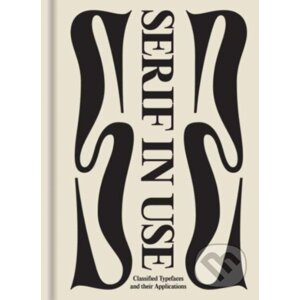
In the world of typography, it is not uncommon to see combinations of serif and sans serif typefaces in the same design. However, it takes skill to combine them in a way to avoid unwanted graphic tension or clashing fonts, and ensure maximum legibility of the text in the design. From font weights to classifications, each typeface has its own distinct personality, and should be carefully paired to convey the right tone and mood of the design. Featuring a selection of type specimens, their design applications, and the thoughts that go behind the craft, Sans in Use / Serif in Use collects the Serif In Use - Victionary od authora a nakladatelství za skvělé ceny na e-shopu Martinus. cz.
| Jazyk |
anglický |
| Počet stran |
512 |
| Rok vydání |
2024 |
| Nakladatelství |
Victionary |